Lab: Use Excel to explore data
OK, now it’s your chance to get hands on with data. In this lab, you’ll use Microsoft Excel Online to explore a simple dataset.
Before you start
If you do not already have a Microsoft account (for example a hotmail.com, live.com. or outlook.com account), sign up for one at https://signup.live.com.
Lab overview
Rosie Reeves is an entrepreneurial middle-school student who sells homemade lemonade from a stand at the park near her house. To promote her lemonade-stand, she distributes leaflets in the park. Rosie records details of her sales and flyer (leaflet) distribution, along with weather measurements including the temperature and rainfall each day.
In this lab, you will explore and visualize the data Rosie recorded.
Exercise 1: Viewing a table of data in Excel
In this exercise, you will upload the Excel workbook containing Rosie’s data to the OneDrive cloud storage account associated with your Microsoft account, and then explore the data in Microsoft Excel Online.
Upload the workbook to OneDrive
-
In your web browser, navigate to https://onedrive.live.com, and sign in using your Microsoft account credentials. You should see the files and folders in your OneDrive, like this:
- On the + New menu, click Folder to create a new folder. You can name this anything you like, for example DAT101. When your new folder appears, click it to open it.
-
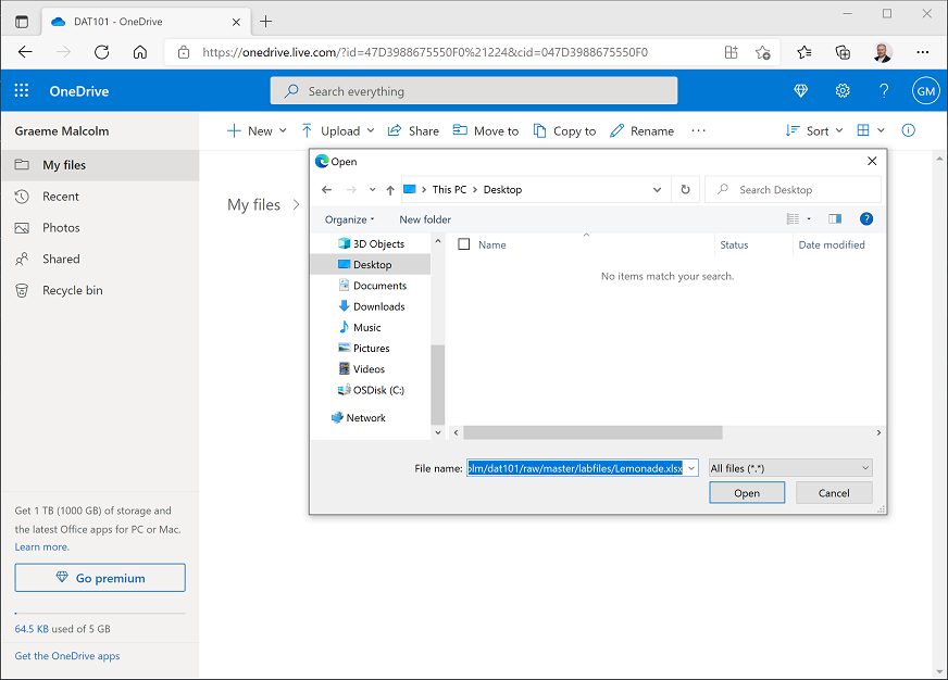
In your new empty folder, on the ⤒ Upload menu, click Files. Then when prompted, in the File name box, enter the following address (you can copy and paste it from here!):
https://github.com/GraemeMalcolm/dat101/raw/master/labfiles/Lemonade.xlsxThen click Open to upload the Excel file containing Rosie’s lemonade data, as shown here:
After a few seconds, the Lemonade.xlsx file should appear in your folder like this:
Open the workbook in Excel Online
-
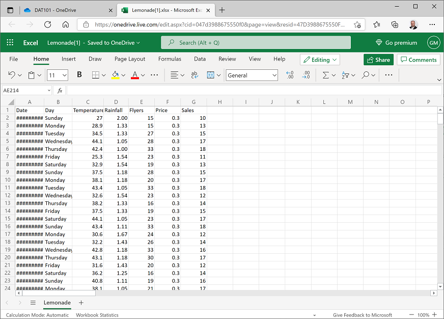
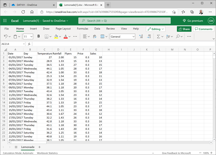
Click the Lemonade.xlsx file in your OneDrive folder to open it in Excel Online. When opened, it should look like this:
-
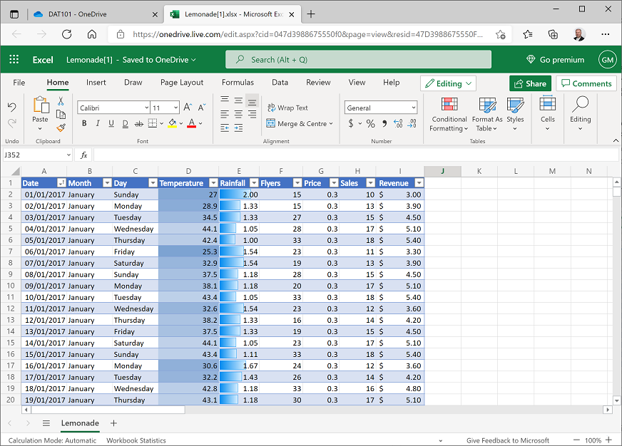
The dates in column A may be too wide to be displayed, so the cells may contain ####### as shown above. To see the dates, double-click the line between the A and B column headers. The dates will then be shown in the format for the locale associated with your Microsoft account. For example, in the following image, the dates are shown in UK format (dd/MM/yyyy).
Filter and sort the data
-
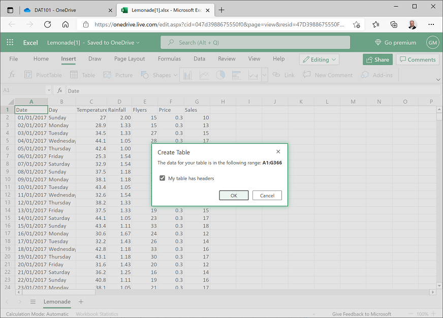
Select cell A1, and then on the Insert tab of the ribbon above the worksheet, click Table. Verify that Excel has automatically detected the data in the range A1:G366, and that the My table has headers checkbox is selected, and then click OK; as shown here:
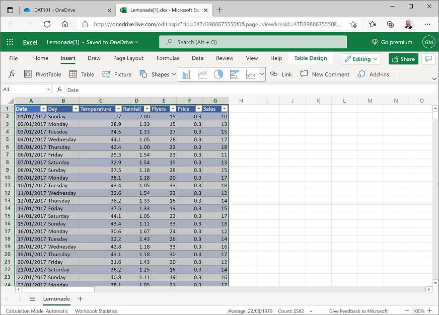
Excel automatically formats the data as a table and adds drop-down buttons to the header row as shown here:
- Click any cell to deselect the table, and then click the drop-down button for the Day column, and click Filter…
-
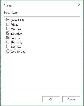
In the Filter dialog box, clear the (Select All) checkbox, and then select only the Saturday and Sunday checkboxes as shown here before clicking OK:
The table of data is filtered to show only the records for weekend days (Saturday and Sunday).
-
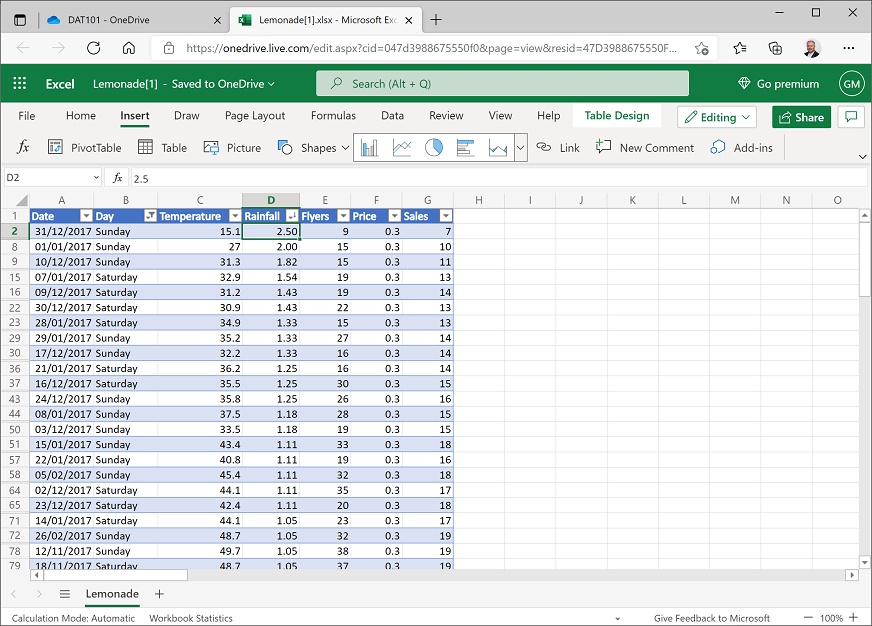
Click the drop-down arrow for the Rainfall column and select Sort Largest to Smallest. The table of data is sorted in descending order of rainfall, so the first row contains the data for the weekend day with the most rain. This was a Sunday on which there was 2.50 cm of rain as shown here:
- Click the drop-down arrow for the Day column again and then select Clear Filter from ‘Day’. The table now shows all the data.
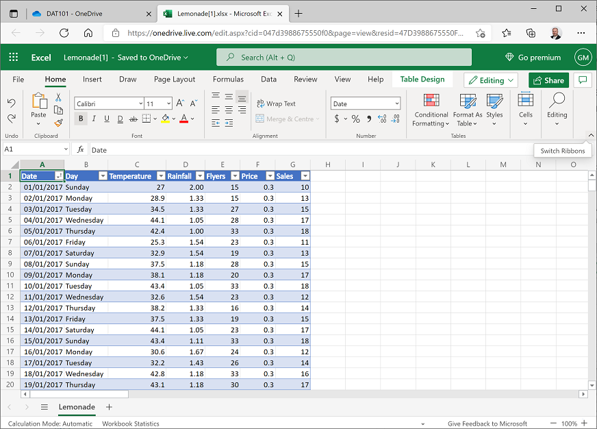
- Click the drop-down arrow for Date and click Sort Oldest to Newest to re-order the data into chronological order.
Challenge: Find the weekday with the lowest temperature
- Using the filter and sort capabilities in Excel Online, filter the data so that only weekdays (Monday to Friday) are shown, and sort the data so that the first row contains data for the weekday with the lowest temperature.
- Make a note of the day and the temperature, and then clear the filter and re-sort the data back into chronological order.
Exercise 2: Using formulae to explore data in Excel
In this exercise, you will use formulae to create derived columns that extend the data recorded by Rosie.
Add derived columns
-
On the Home tab, at the right side of the menu area, use the Switch Ribbons (v) button to expand the ribbon and show the full toolbar (the Switch Ribbons icon will change to ^):
-
Click the B column header to select the entire B column. Then on the Home tab of the ribbon, in the Cells section, in the Insert drop-down menu, click Insert Sheet Columns (depending on the size of your browser window, you may need to expand a Cells menu to see the Insert menu.
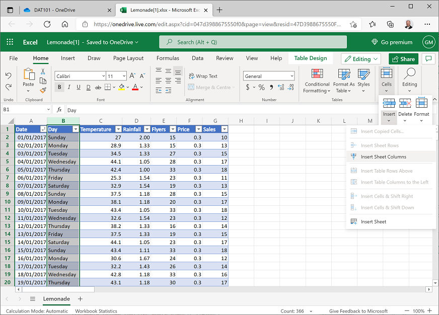
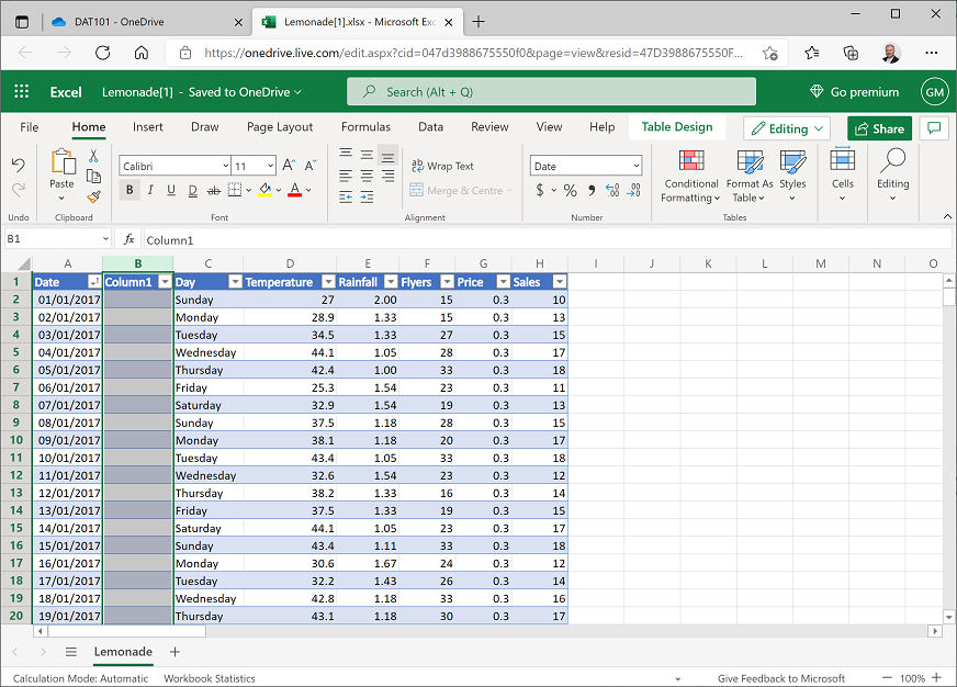
This inserts a new Column1 column between the Date and Day columns as shown here:
-
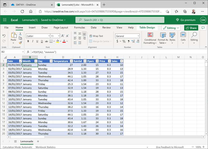
In cell B1, rename Column1 to Month. Then with cell B2selected, in the fx bar above the data, enter the following formula:
=TEXT(A2, "mmmm")After you enter the formula, it should be copied automatically to all the other Month cells in the table, and the name of the month for each record should be displayed as shown here:
-
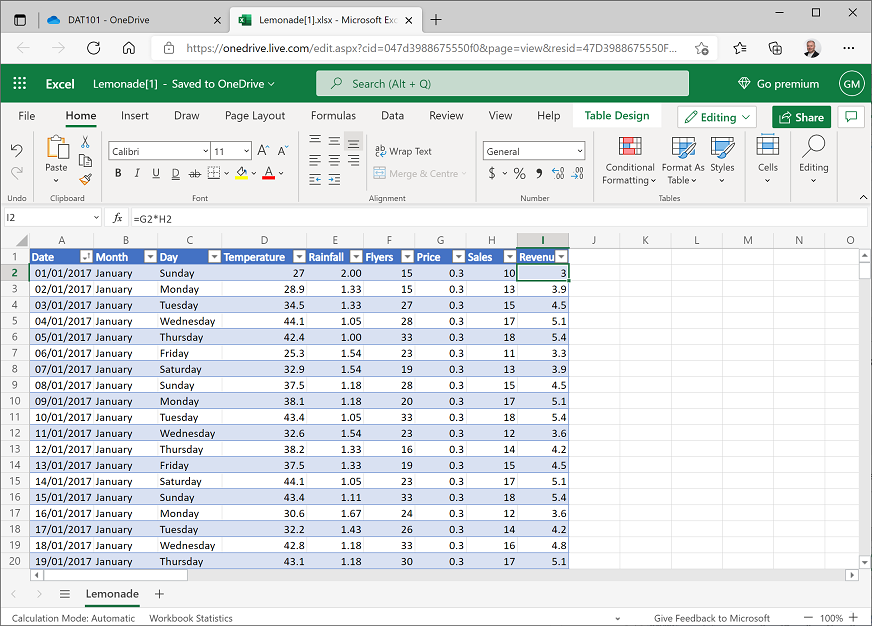
In cell I1, enter the text Revenue to add a new Revenue column to the table. Then with cell I2 selected, in the fx bar above the data, enter the following formula:
=G2*H2The formula is again automatically copied to the remaining rows in the table, and the Revenue (calculated as Price multiplied by Sales) is displayed as shown here:
-
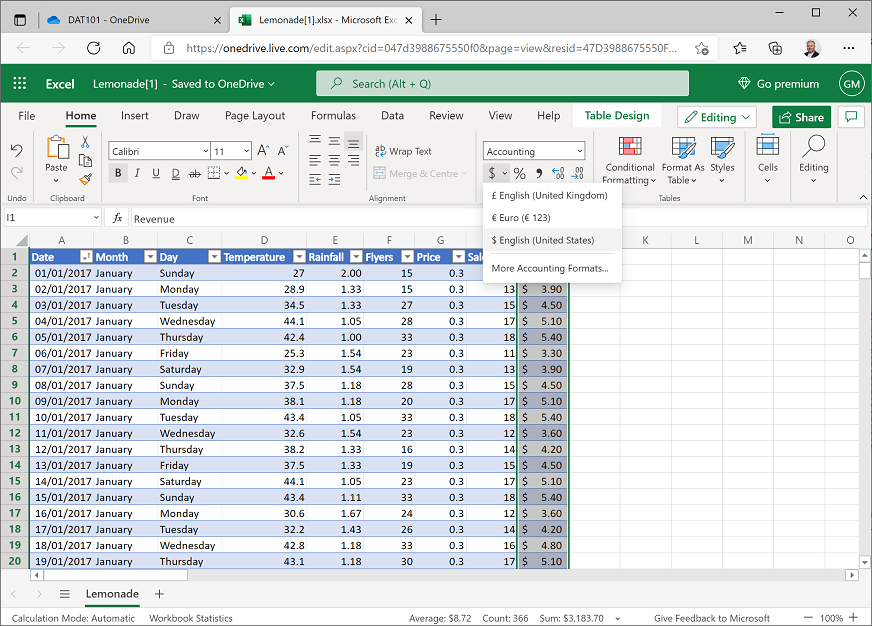
Click the I column header to select the entire column, and then on the Home tab of the ribbon, in the Number section, in the $ drop-down list, select $ English (United States). This formats the revenue data as US dollars:
-
Scroll down to the bottom of the table of data, select cell I367 (under the Revenue column). Then on the Home tab of the ribbon, in the Editing section, in the AutoSum (Σ) drop-down menu, click Σ Sum.
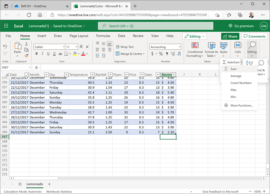
This enters the following formula:
=SUBTOTAL(109,[Revenue])This formula references Revenue as a named column in the table and calculates the total of the values in that column. You could achieve the same result by entering
=SUM(I2:I366)but by using the AutoSum function, the resulting value is included in the definition of the table (you may need to widen column I to see the value):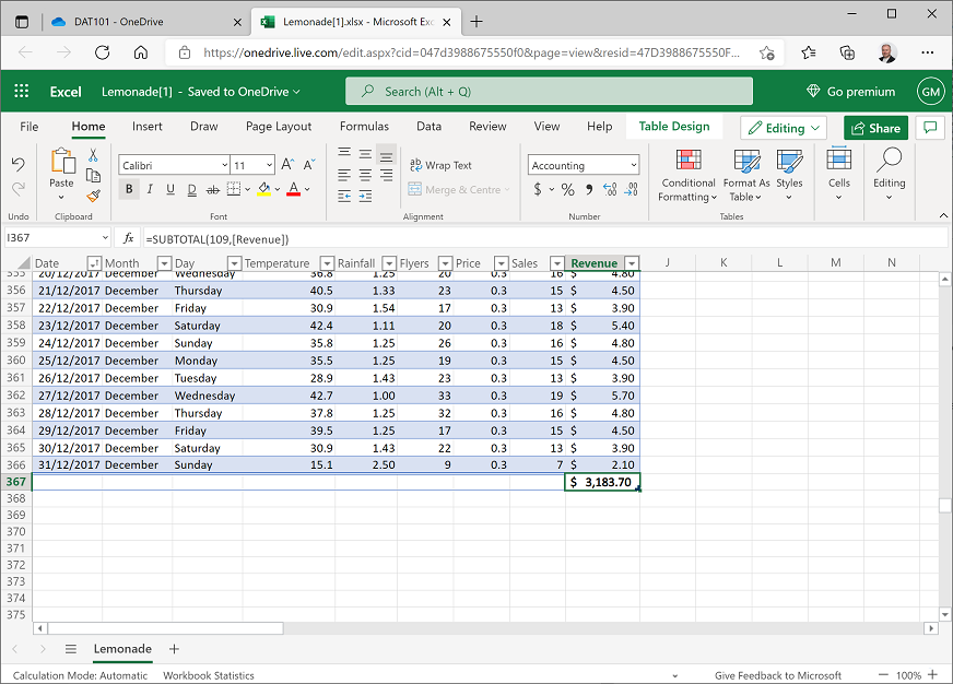
-
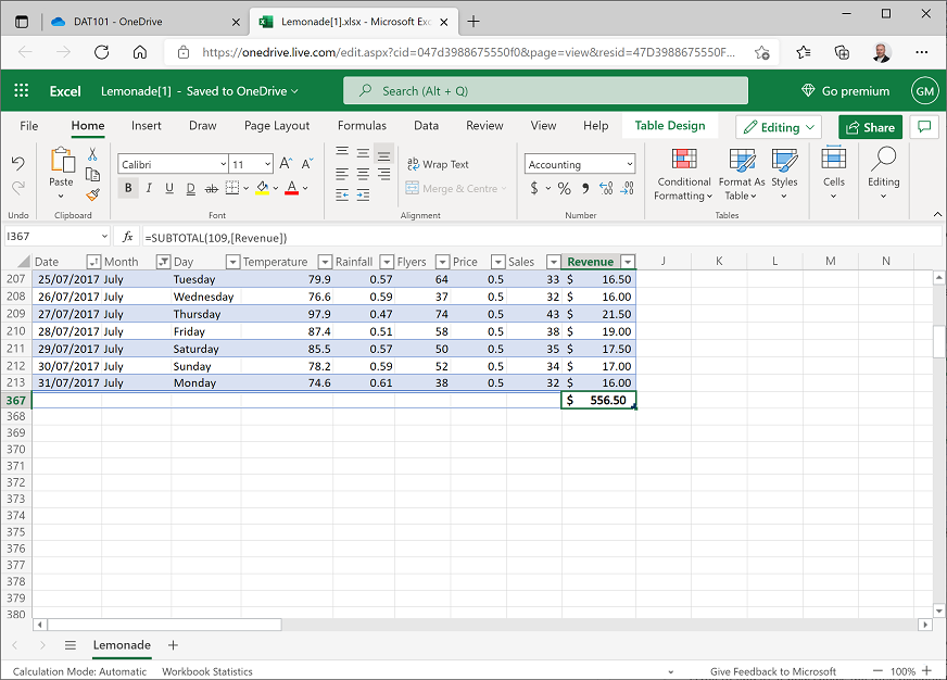
Filter the Month column to show only the records for July, and then look at the subtotal at the bottom of the Revenue column (you may need to scroll to find it). It now shows the total revenue for July.
-
Clear the filter on Month to show all the data, and verify that the revenue total reflects all months again.
Challenge: Find the total number of flyers distributed
- Add a cell under the Flyers column that contains the total number of flyers Rosie distributed. Format this column using the Comma Style (,) number format so that the total is formatted like 00,000.00.
- Note the total amount for the year, and then filter the data to find the number of flyers distributed in the month of January. Don’t forget to clear the filter when you’re done!
Exercise 3: Using conditional formatting to explore data
In this exercise, you will apply conditional formatting to data to highlight key values of interest.
Highlight extremes and outliers
- Select cell D2 and then hold the Shift and Ctrl keys and press the Down-Arrow key to select all the values in the Temperature column (if you are using a Mac OSX computer, hold the Shift and ⌘ keys, and press the Down-Arrow key).
-
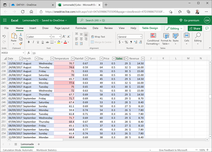
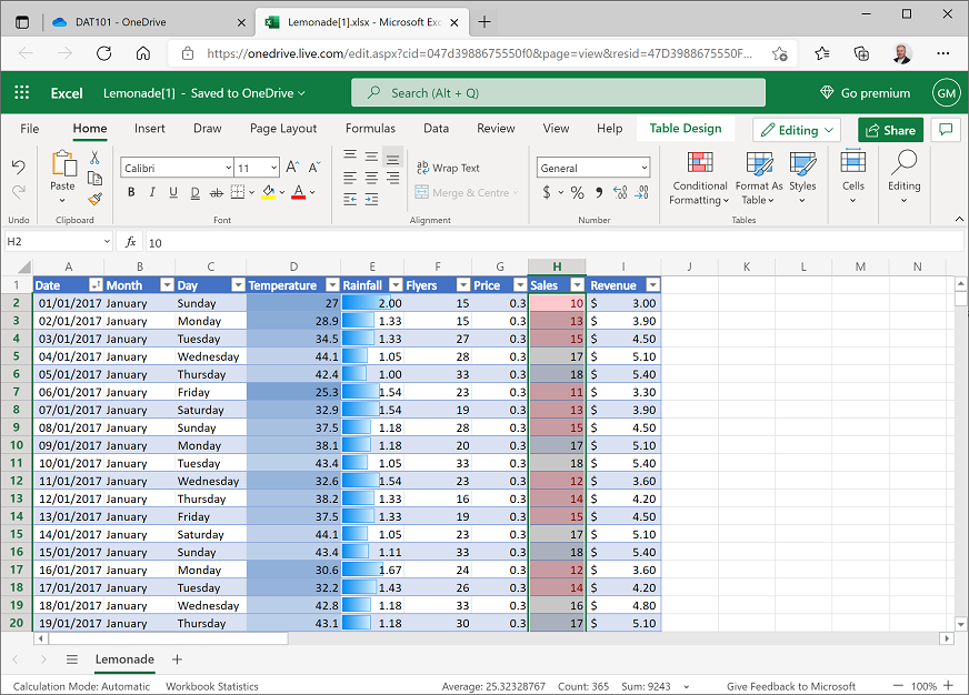
On the Home tab of the ribbon, in the Conditional Formatting drop-down list, point to Color Scales, and select the Red-White-Blue Color Scale (with red at the top, white in the middle, and blue at the bottom). The Temperature cells are reformatted so that the hottest days are colored an intense red, and the coolest days are deep blue. Scrolling through the data now, it is easier to find days that are particularly hot or cool.
-
Select all the values in the Rainfall column, and then in the Conditional Formatting drop-down list, point to Data Bars, and select the Light Blue Data Bar gradient fill. The cells are formatted with a visual indication of the comparative level of rainfall for each day.
-
Select all the values in the Sales column, and then in the Conditional Formatting drop-down list, point to Top/Bottom Rules, and select Top 10%. Then in the Top 10% dialog box, select Green Fill with Dark Green Text and click Done. The cells containing sales values in the top 10% are highlighted in green (you may need to scroll to see them) and the Conditional Formatting pane remains open.
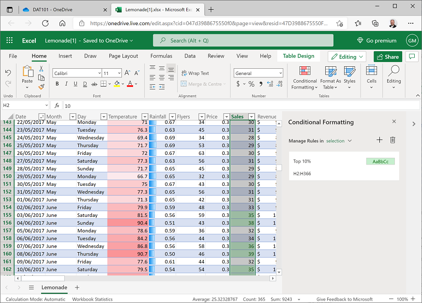
- Reselect the values in the Sales column if you deselected them, and then in the Conditional Formatting pane, click + to add a new rule with the following settings:
- Apply to range: H2:H366
- If true then stop: Unselected
- Rule type: Top/Bottom
- Bottom 10 percent
- Format with: Light Red Fill with Dark Red Text
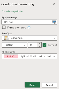
Click Done to apply the fomatting and then close the Conditional Formatting pane with the x icon at its top right. The cells containing sales values in the bottom 10% are highlighted in red (again, you may need to scroll to see them).
Challenge: Compare temperature, rainfall, and sales
Now that you’ve highlighted the cells, you can more easily make visual comparisons between temperature, rainfall, and sales values.
Scroll through the data, and just by looking at the visual formatting you’ve added, try to see if you can spot any relationship between temperature, rainfall, and sales that might form the basis of a hypothesis you’ll want to investigate more thoroughly.
| < Back | Next > |